
our story
- ◆ we believe kids learn best when they play, explore, and create.
- ◆ we give children and families fun, hands-on ways to discover and learn.
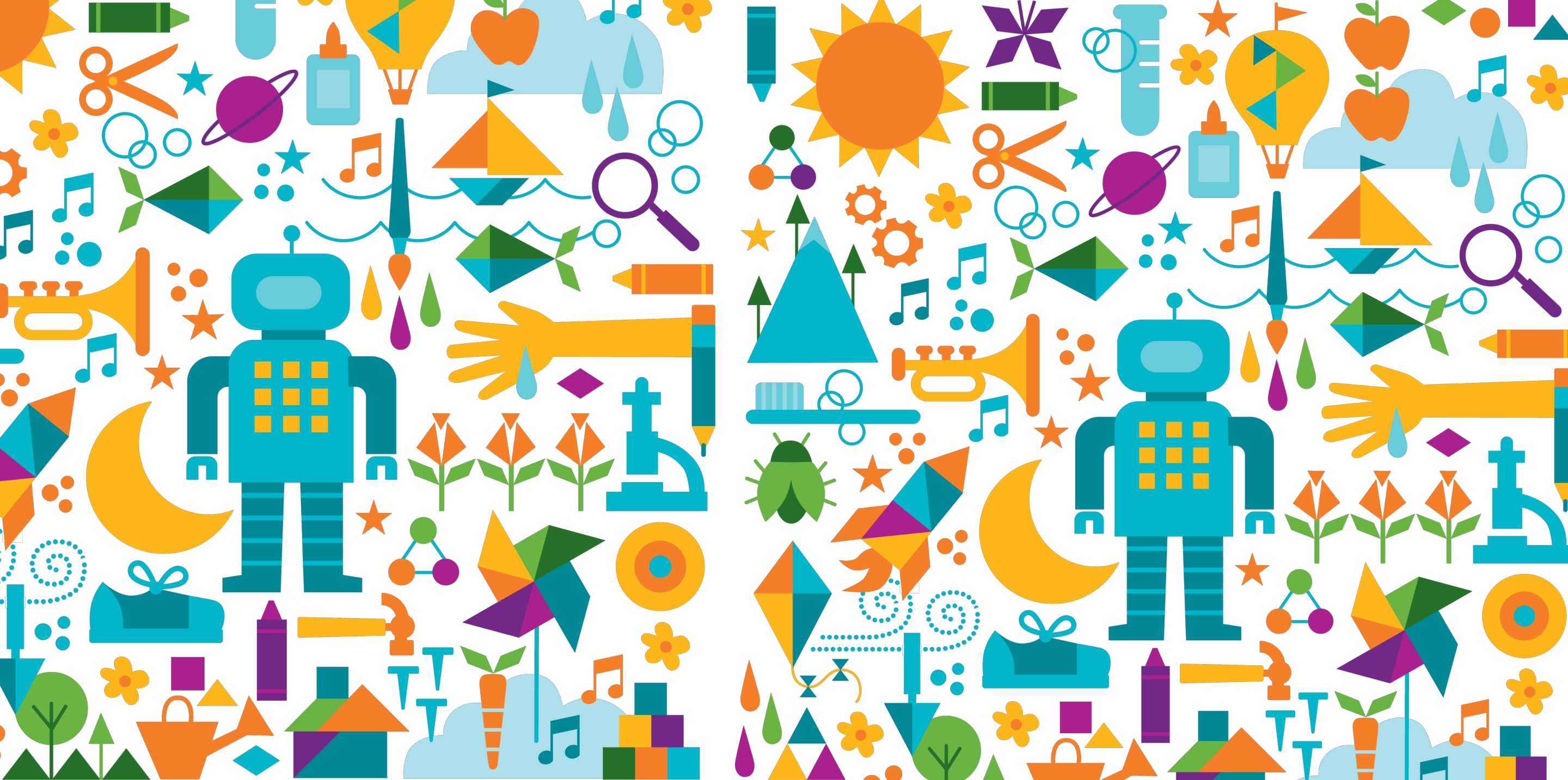
This case study explores the design of a mobile experience for the Children’s Museum, transforming an established brand identity into an engaging and accessible digital interface. Guided by the museum’s playful visual language and brand guidelines, the project balances creativity with usability to create an experience that inspires curiosity while remaining intuitive for both children and adults.
The brand personality guided all my design choices. I wanted every screen to feel playful through the use of bright colors, inventive, that make the experience feel creative and hands-on, welcoming, a design that's open and easy to navigate.
The challenge is finding balance. The museum's audience includes both children and adults, so I needed to design something bright and playful at the same time without losing clarity or accessibility.
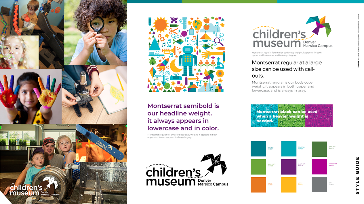
I first created style guides from the brand book, I collected all the key elements — the logo, photography, color palette, the Montserrat typeface, and the illustrations that represent brand. Having these helped me understand how the brand speaks visually.
Next, I explored different sketches for the design.
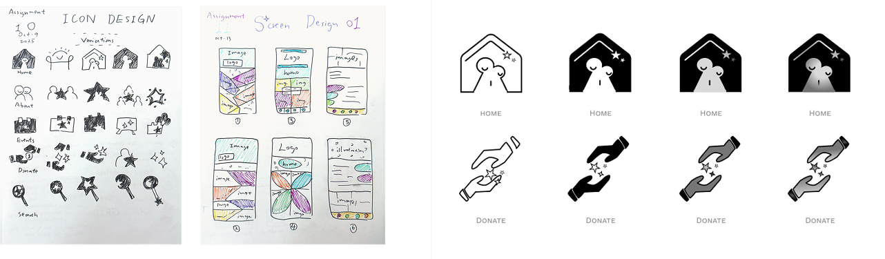
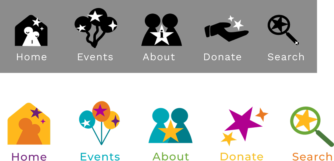
I chose the two icon designs that stood out the most, and I noticed that by chance they both had a little star element. I realized that the star was perfect for this brand because it represents discovery, imagination, and curiosity — everything the Children's Museum stands for. So I kept that element and used it throughout all the icons to create consistency. The second round the icons are still too detailed, so I simplified them, sticking to organic and geometric shapes only. Then I gave them colors and here's my final icon designs.
Then came the challenge. When I started designing the home screen, I wanted to include as many fun and colorful elements from the brand as possible. I wanted to be creative so I played around with the shapes and colors. But then it became too crowded, the hierarchy is unclear — it lost the sense of clarity and balance that the brand also values.
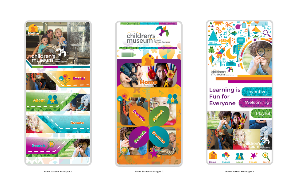
I chose my favorite out of the three. As a decorative person, it's hard to take away elements. My professor points out that I should be prioritizing accessibility over decorating.
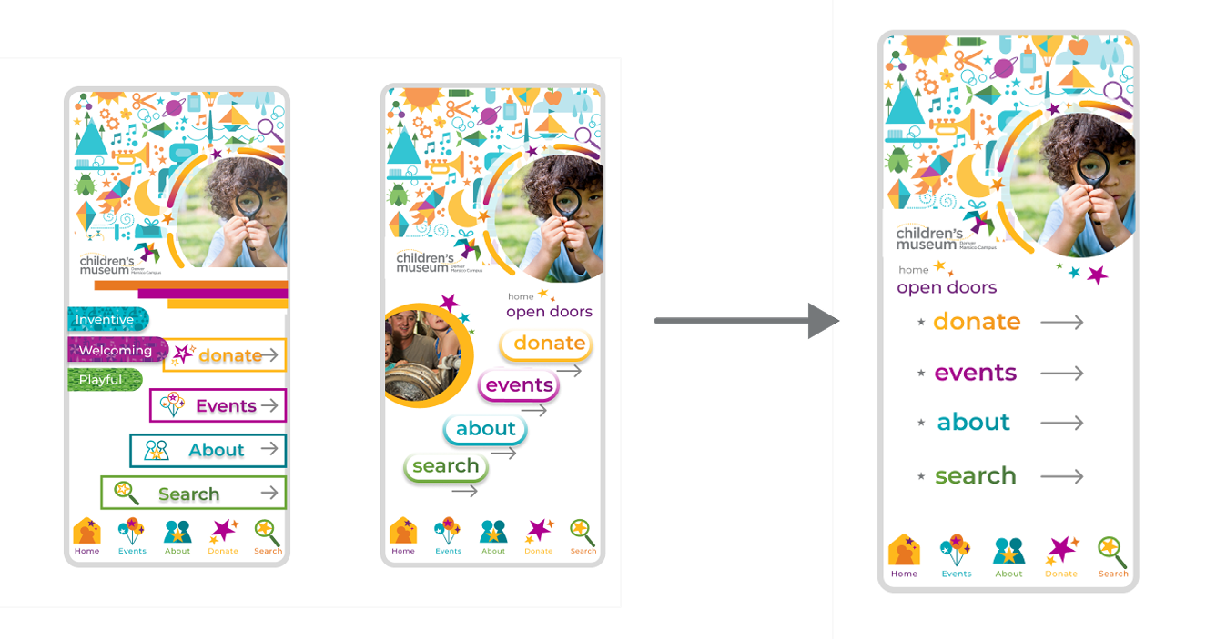
I began making improvements, it's becoming more simple and legible, making the hierarchy clear. After several rounds of editing, took away all the distractions and made it nice and simple.
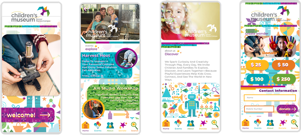
As you can see the rest of the screens have another problem which is consistency. All the screens have different layout and elements used, and too many variations of font sizes.
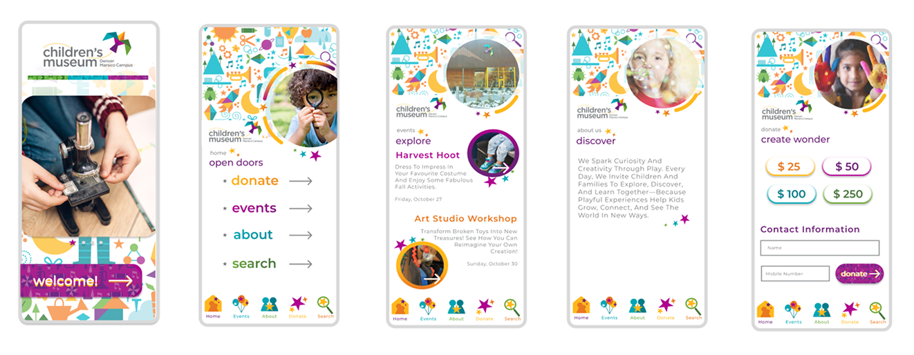
I went back to brand book and re-read the how-we-look. I tried to align the rest of the screens with the design of the Home Screen, I focused on making the layout clean, legible. I included the star element used in the icons, adding the sense of playfulness and curiosity. I made the call to action buttons purple, and bolded the words, making the buttons stand out from the background, which feels welcoming. In the end, the final design feels true to the Children's Museum — bright, imaginative, and easy to explore.
From this project, I learned that design does not have to be too complicated, keep it clean and consistent; use what the brand offers, do not design too many new things; be careful with colorful elements, they might conflict with each other. And lastly, I learned that being creative doesn't mean adding more — sometimes, it’s about refining until every element has a clear purpose.

©2026 Amanda Yu. All rights reserved
