This case study explores the development of a complete visual identity for PowerCare, a speculative healthcare
brand I created to empower college students to take charge of their well-being. From defining the
brand strategy and personality to crafting a cohesive visual identity and applying it across print,
web, and mobile touchpoints, every design decision was made to create an accessible, uplifting, and
trustworthy brand experience.
RoleVisual Brand Design
TeamSolo
StartNovember 2025
Duration1 month
ToolsFigma
Our Goal
We believe that with good health, anything is possible.
We are a health plan exclusively for college students, providing easy access to health services, and empowering information to support healthy life choices.
Our Personality
When I started designing PowerCare, I wanted the brand to feel like a support system students could
trust, a source of energy—something that motivates them to live their best lives. That's why the
personality of the brand is centered on three qualities:
Active energetic and aligned with student life
Inspiring motivating students to build healthy habits
Empowering helping students take control of their health journey
Design Process
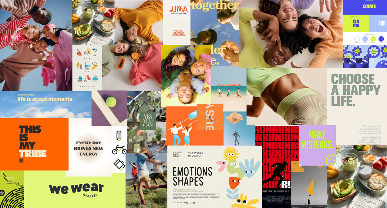
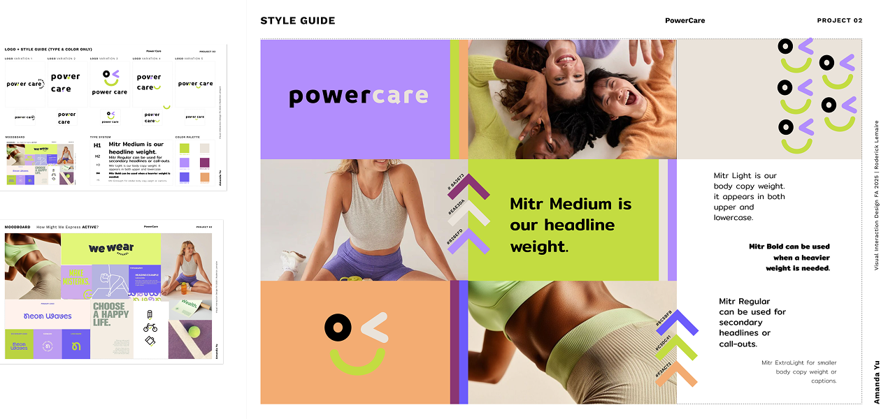
I started by exploring different visual directions by gathering good images that could communicate these traits.
Moodboards
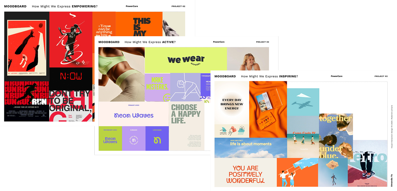
From these, I created three moodboards, each focusing on a different side of the brand personality.
One leaned more empowering and confident, one felt more active and engaging, and the last one is
inspiring and wellness-centered.
Logo
Next, based on the three moodboards I began sketching logos, experimented with fonts, and extracted
colors from each moodboard that could well present the brand personality.
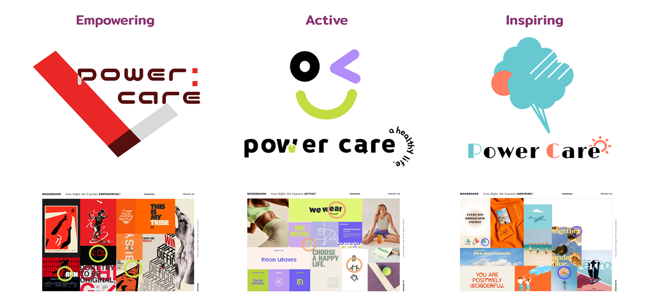
Then I used the brainstorm and elements from the moodboard as a guide and designed three logos that
well represented each moodboard. Looking at them side by side helped me get a better sense of which
styling is best represents students living their best lives. And to me the middle's colors and
liveliness feels like the best match for the brand so I selected it for further development.
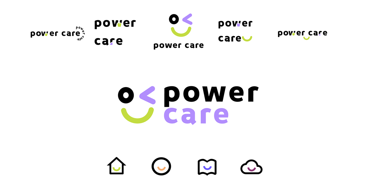
Since I had too much design elements going on in one logo, so I must simplify and emphasize on one
key design element. But also at the same time watch out for balance between the type and the icon.
Things really clicked when I realized that a simple smile could carry the entire brand story. When a
student sees the smile, the brand immediately communicates positivity, and encouragement. It's an
active symbol because it's visually uplifting — mirroring the idea of
growth. It's inspiring because it reminds students that well-being is
something joyful and achievable. And most importantly, it's empowering,
because the smile suggests confidence and self-care. So I decided to emphasize on the smile for the
finalized logo.
The smile became the key that tied together the brand belief and personality. Which carried on across
the entire brand, and in the icons that were used in the mobile screens later.
Style Guide
Once the logo was established, the direction of the branding was clear. I built the full style guide
around it. I refined the color palette to keep it bright and uplifting, but also adding a soft cream
and low saturated purple to balance the accessibility. I chose typography that reinforced clarity and
confidence, and created a visual system that feels fresh, friendly, and engaging. The vertical stripes
and arrow moving forward/upward are the decorative elements I have chosen to reflect my brand. Moving
up and forward symbolizing progress of students moving towards a better life and health, feel
inspiring and empowering. And the complementary colors of the stripes create better visual impacts.
Every element supports one message: PowerCare helps students live their best life.
Final Design
Across the entire system, I carried this sense of upward energy and optimism into the touch points.
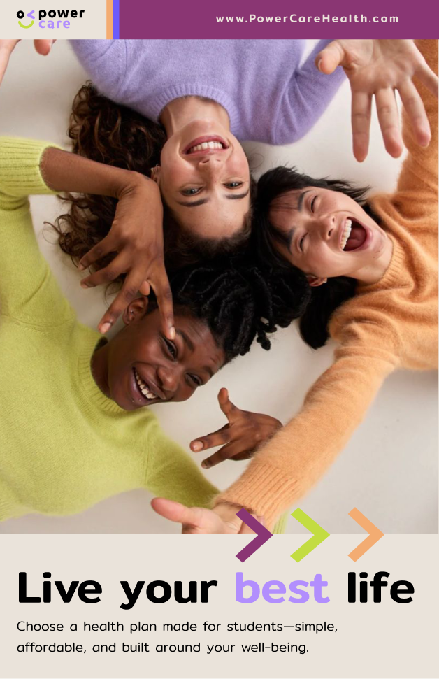
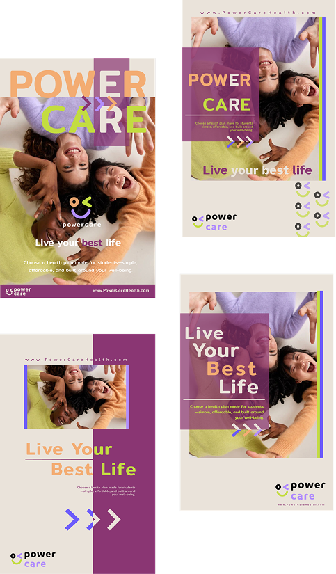
Poster
The poster's purpose is to immediately catch attention. After a few versions of editing, the layout
communicates the core identity to "Live your best life" quick and memorable.
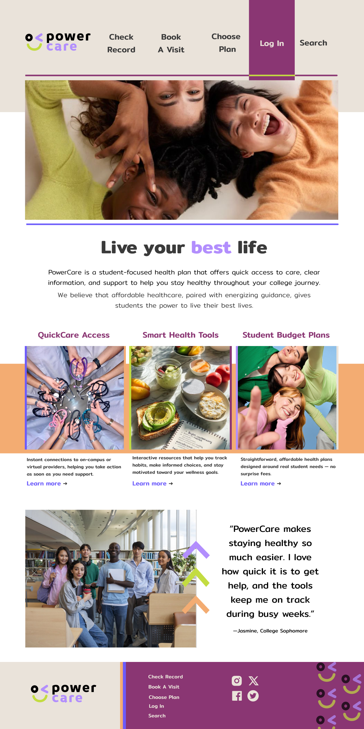
Web Landing Page
The website extends the same visual language. I focused on accessibility, simplicity, and a positive
tone for the web landing page. The goal was to make health information feel easy to understand and
visually inviting.
"PowerCare makes staying healthy so much easier. I love how quick it is to get help, and the tools keep me on track during busy weeks."
— Jasmine, College Sophomore
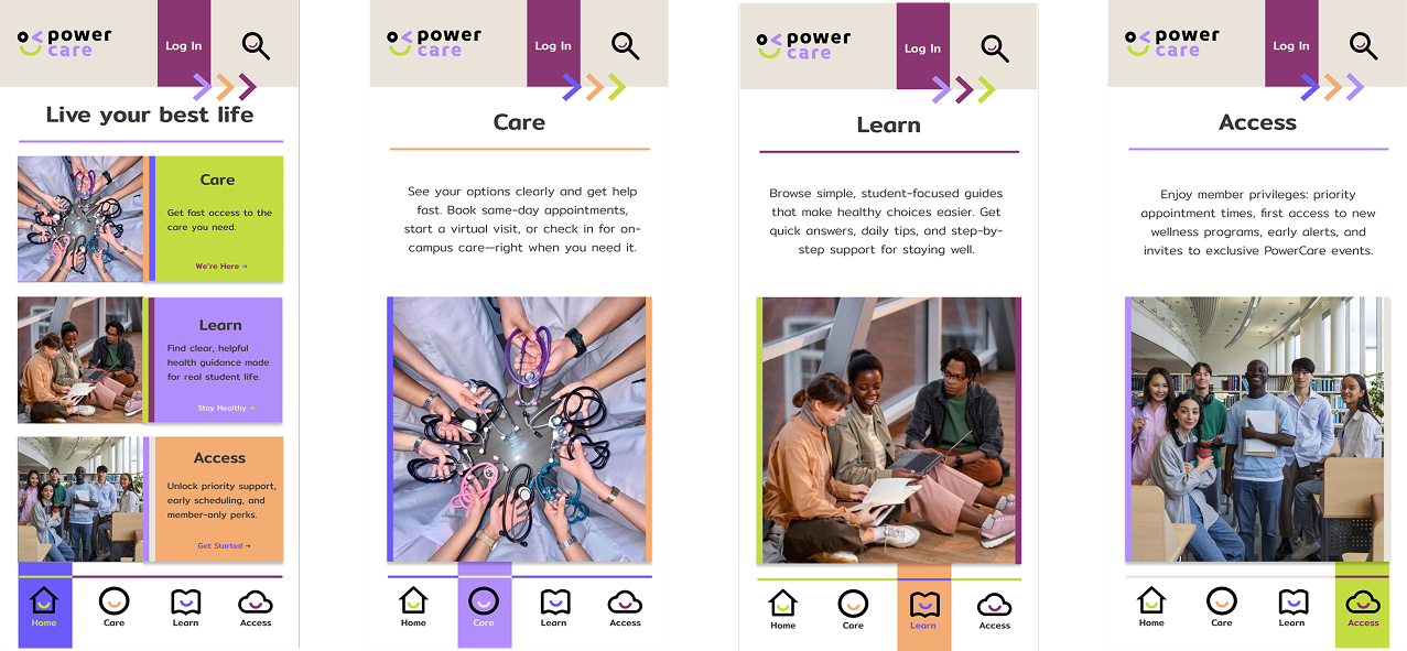
App Screens
The mobile screens use clean layouts, bold headers, and the smile motif to keep the experience
energetic and student-friendly. The bright color palette keeps things easy to navigate and visually
uplifting. Overall, the design reinforces clarity, confidence, and motivation.
This project taught me how powerful brand personality can be when it guides design decisions. I
learned how to communicate emotion through color, typography, and icons, and how consistency creates
trust. Most importantly, it challenged me to design with empathy—thinking about what students feel.
PowerCare pushed me forward as a designer, and it showed me how meaningful visual design can be when
it supports real people and real needs.


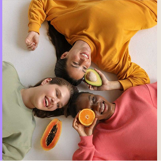
 We believe that with good health, anything is possible.
 We are a health plan exclusively for college students, providing easy access to health services, and empowering information to support healthy life choices.
 energetic and aligned with student life
 motivating students to build healthy habits
 helping students take control of their health journey