
The Adherence Project
Med-A
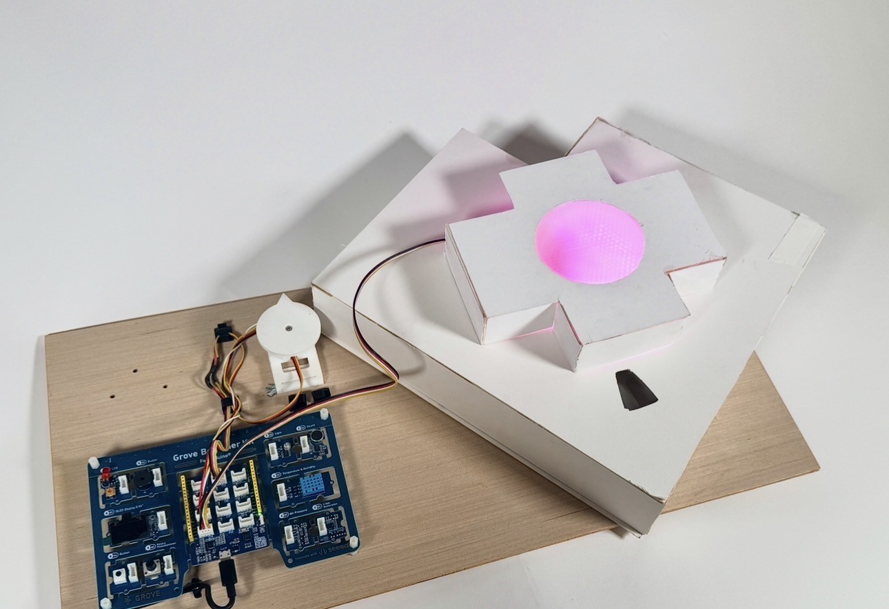
By using a robotic pill dispenser and a supporting app, the project tries to reduce forgetting, confusion, and mistakes when taking daily medication.
By using a robotic pill dispenser and a supporting app, the project tries to reduce forgetting, confusion, and mistakes when taking daily medication.
Medical adherence is a very common and serious problem. People often forget to take their pills, take it at the wrong time, or stop taking it too early. This can happen because people are busy, distracted, confused by instructions, or simply just forget. Poor medical adherence can lead to health problems getting worse, longer recovery times, or unnecessary hospital visits; because of this, helping people take their medicine correctly is an important issue in healthcare.
The main goal of this project was to design a system that helps improve medical adherence, specifically helping users take their medication as directed. This included designing both a mobile app and a robotic pill dispenser that work together to support daily medication routines. The project also focused on making the system easy to understand, interactive, and accessible, so users would feel supported rather than overwhelmed when managing their medication.
The app needed to guide users through all the basic medication-related tasks in a clear and simple way, and is designed as an interactive prototype using Figma and ProtoPie.
The app also worked together with the robotic pill dispenser, which automatically rotates to the correct position and uses cues to reinforce what is shown in the app.
To me, accessible design means creating products that can be used and understood by everyone easily, regardless of age, gender, or technical experience. It means reducing confusion, supporting different ways of interacting, and making sure users do not rely on only one sense, such as vision only to complete important tasks. In the context of medical adherence, accessibility is especially important because users are probably all dealing with health challenges, and a well-designed system should feel supportive and clear.
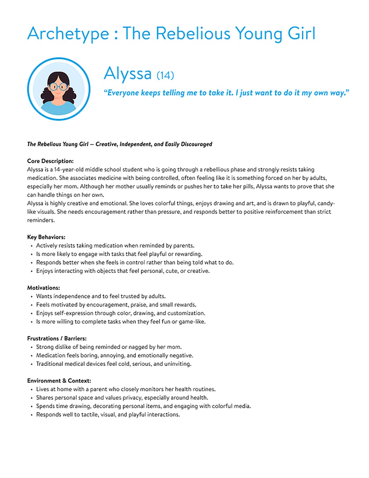
To support Alyssa, the pill dispenser is designed to feel welcoming and playful rather than a serious medical tool. Since she is in love with colors and art, color plays a crucial role in the design: each day of the week is represented by a different rainbow color, turning medication into a visually engaging routine. The overall look and feeling of the dispenser is inspired by cotton candy and soothing meditation, creating a soft, colorful, and joyful experience that helps reduce resistance and negative emotions around taking medicine.
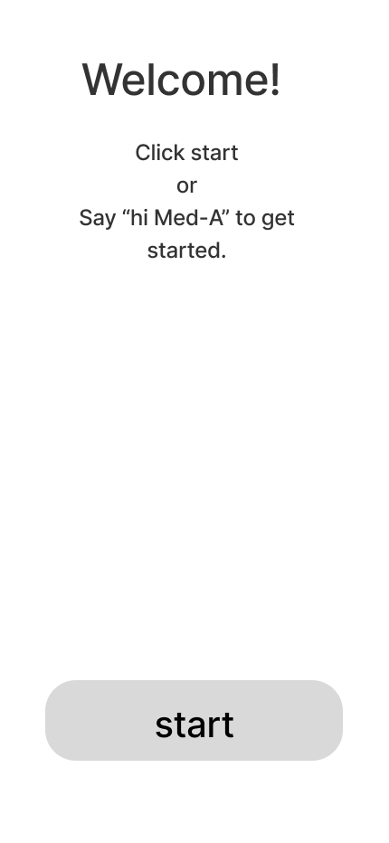
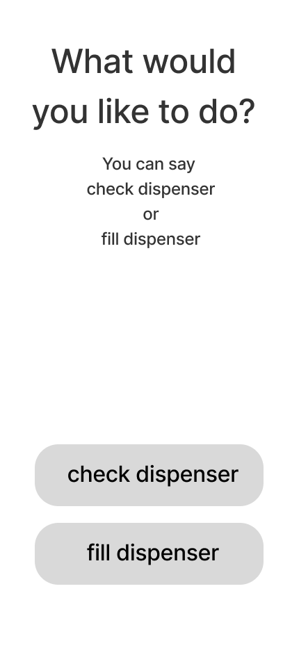
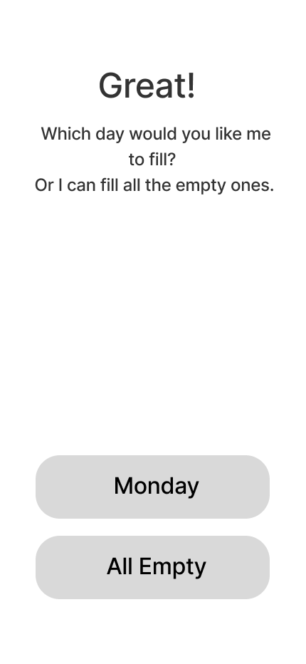
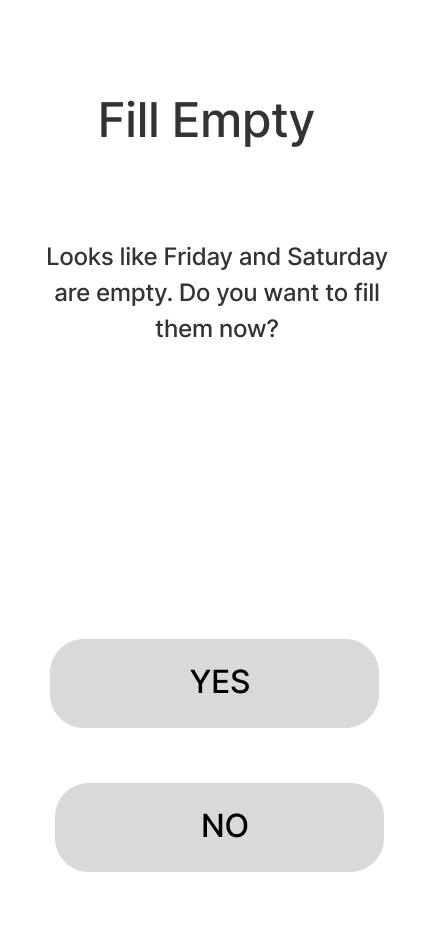
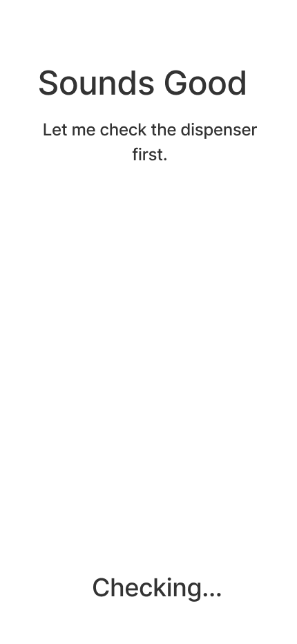
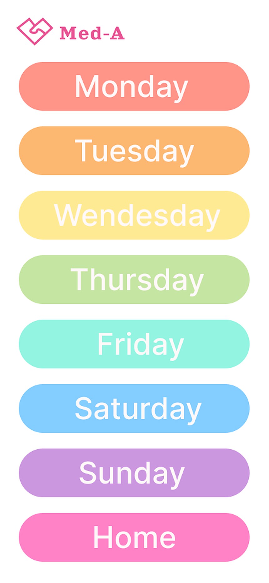
In addition, the voice command feature allows Alyssa to interact with the pill dispenser on her own, without needing her mom’s reminders. This reinforces a sense of independence and control, helping her feel trusted. By combining color, positive emotion, and hands-free interaction, the design encourages Alyssa to take ownership of her medication routine in a way that feels fun and empowering.
Creating a user flow diagram was extremely helpful to my design process this time, because this project involved many steps and interactions, especially because it combined both an app and a physical pill dispenser plus light cues. Mapping out each step clearly helped me understand the full experience and made sure I did not feel confused when I began building the interactions.
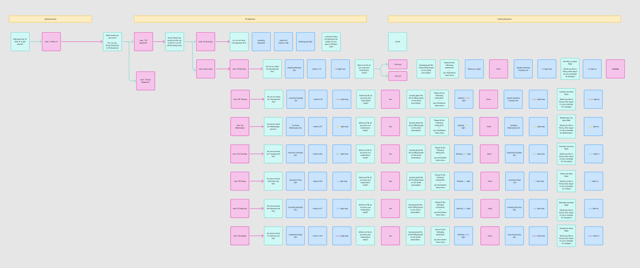
After completing the first version of the user flow, I tested it and realized that some of the lighting cues were not very clear or effective. Because of this, I adjusted the placement and timing of the lights to better match the user’s expectations. I also noticed that some parts of the user flow felt confusing or unnecessary, so I simplified and reorganized those steps. Making these changes helped create a smoother and more intuitive experience for the user.
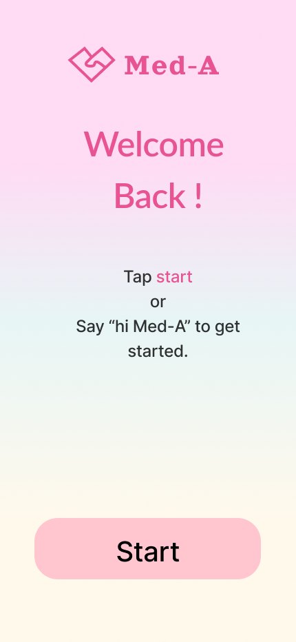
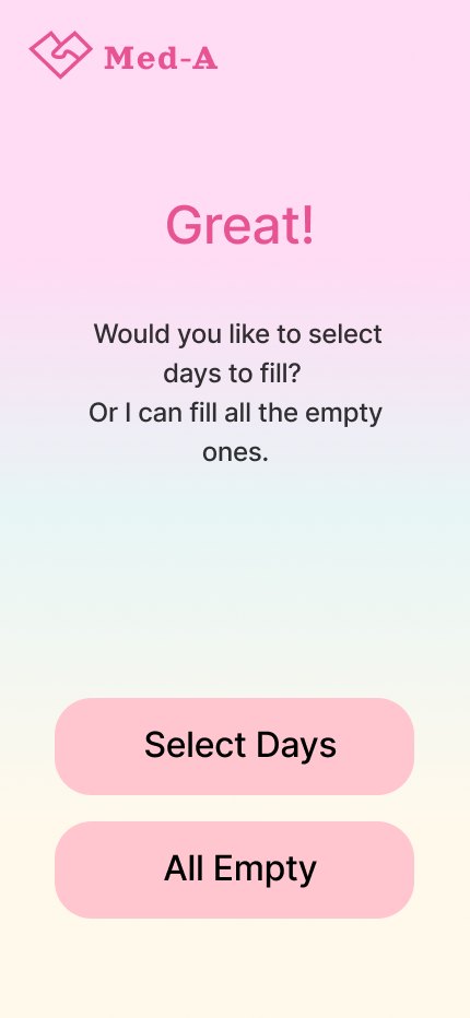
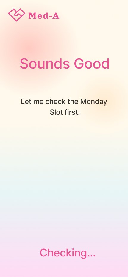
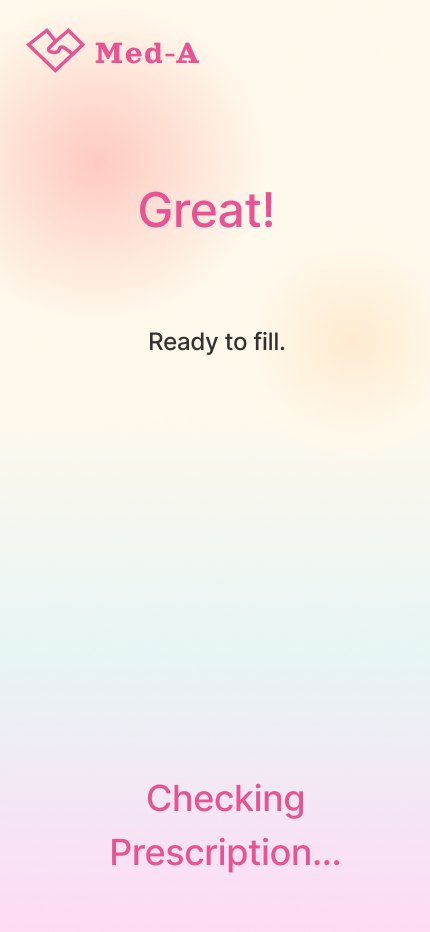
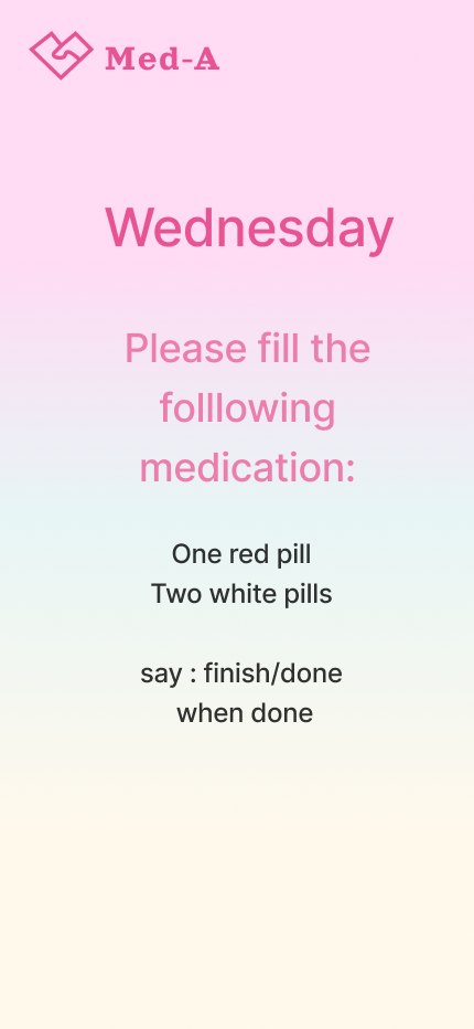
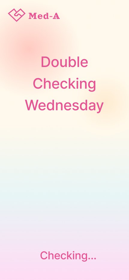
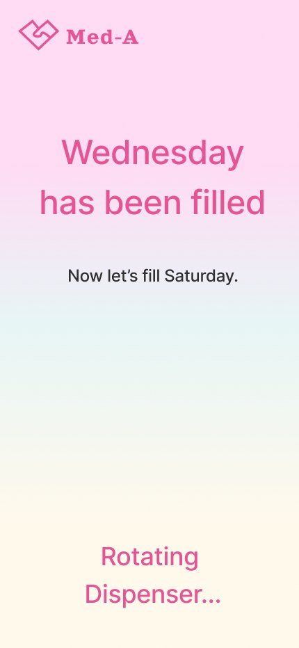
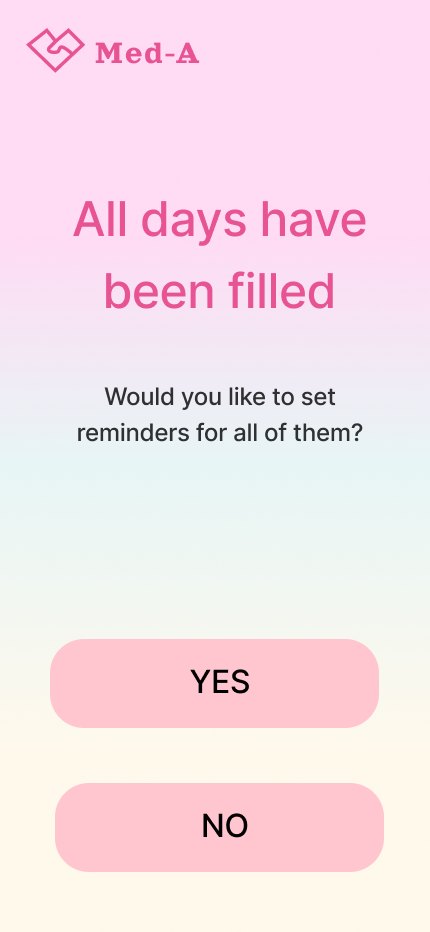
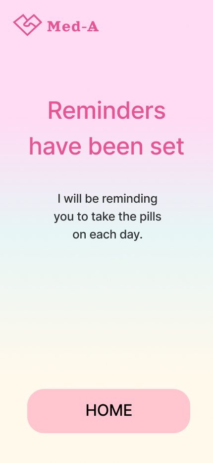
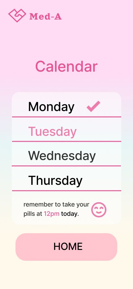
Designing voice interactions taught me that good voice experiences need to guide the user naturally: they should be clear and well-timed. Simple language and clear prompts help users understand what to do without feeling confused or pressured.
The most challenging part was working with the microphone. It was often unreliable and sometimes picked up its own voice, causing the system to jump ahead. Because of this, designing and calculating the timing between speech, pauses, and when the microphone listens was the hardest part. This process showed me that voice interaction design requires careful testing and attention to small details.
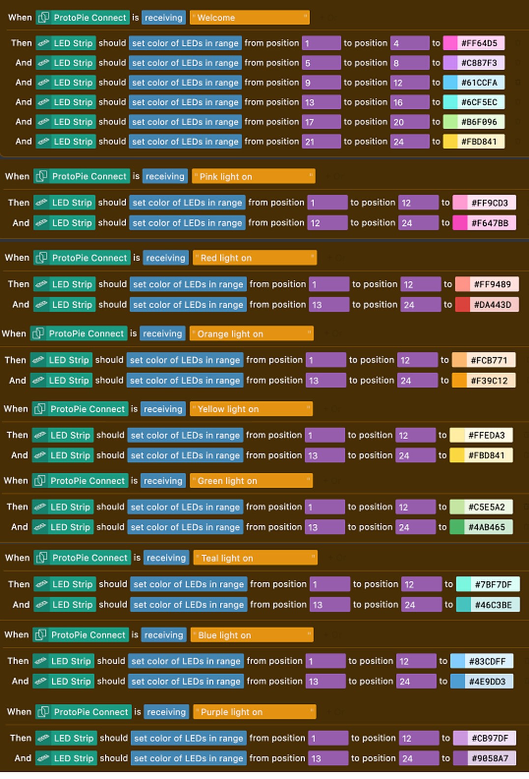
Using ProtoPie and Blokdots on top of Figma significantly improved the quality of my prototype. With Blokdots, I could run a real user test on my own phone, which made testing feel much more realistic and helped me quickly find and fix issues, and ProtoPie was far more intuitive than linking many Figma frames for one simple interaction. In the future, I would like to use Blokdots to explore physical buttons, switches, and other tangible inputs, as these tools have a lot of potential for engaging physical-digital experiences.
The shape of my pill box was designed to match the overall visual language of the app and brand. I chose a paper heart shape because it feels cute, soft, and friendly, which aligns well with the target user: a young girl who responds better to cute and encouraging designs. The heart shape also matches my logo, helping create a consistent and recognizable identity across both the digital and physical experience.

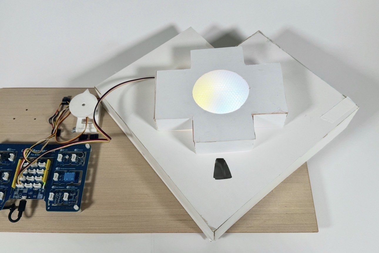
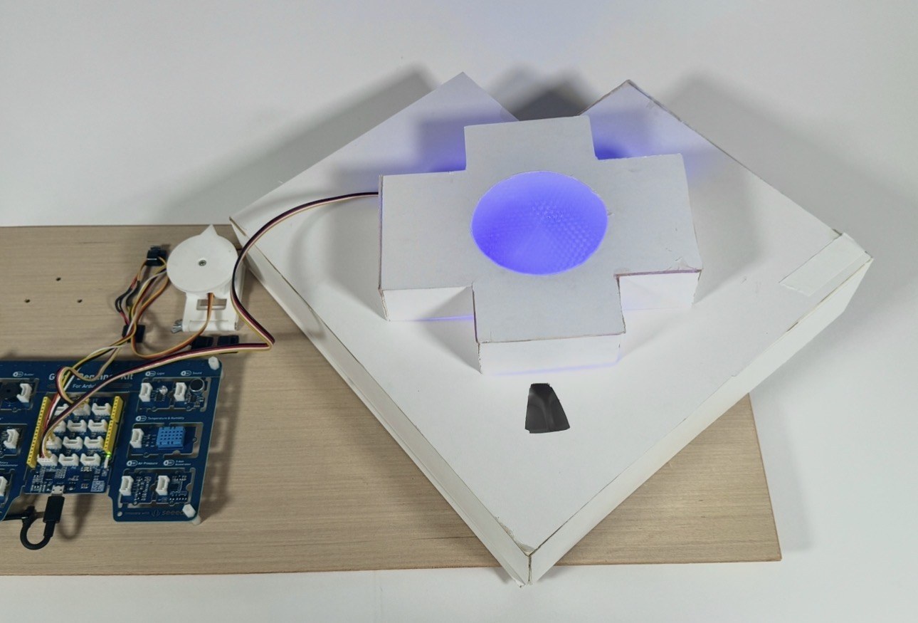
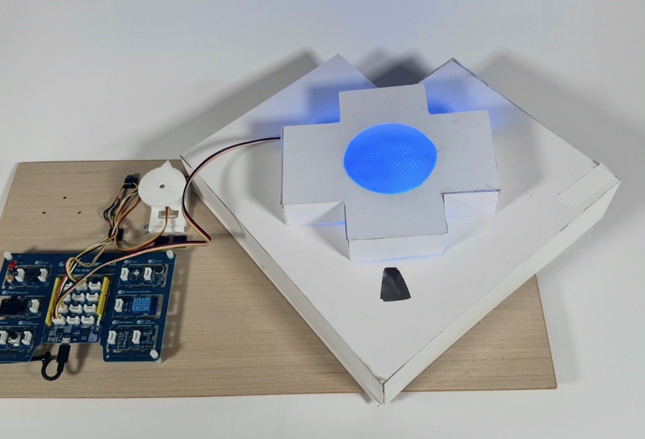
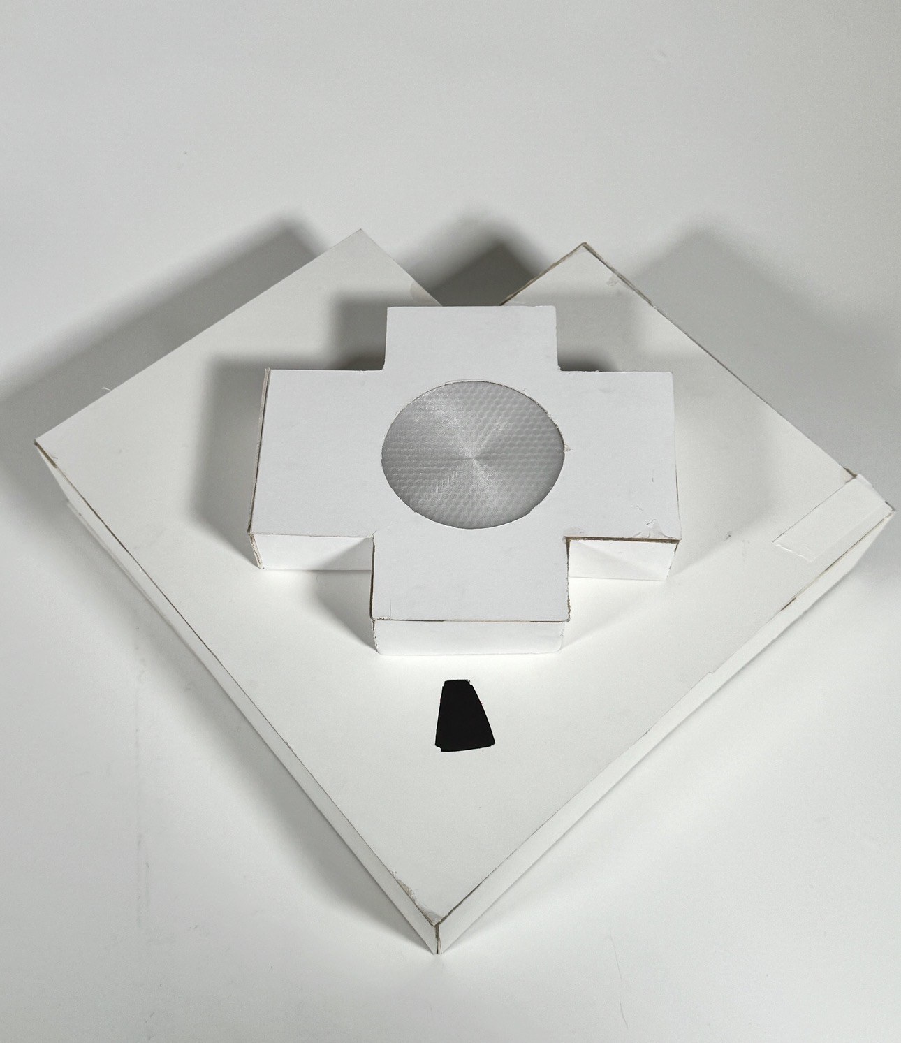
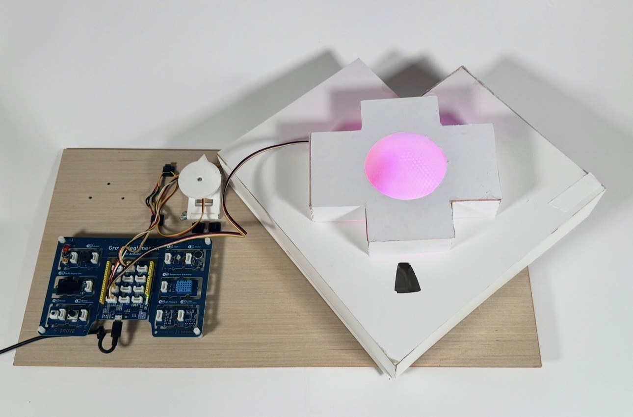
Before reaching the final design, I went through several iterations. Earlier versions included designs with drawers at the bottom for storing pill bottles, and some versions were more complex in structure. Then I realized that a simpler geometric form, something more playful than a basic square or circle and more unique, worked better for both usability and aesthetics. Simplifying the shape helped the design feel more approachable and a little less like a medical device.
Through physical prototyping, I learned how important precision is. Every measurement needed to be accurate in order for the pieces to fit together properly. Since we used stronger glue that was difficult to separate once applied, mistakes were not permitted. This taught me to slow down and plan carefully, which is something I will carry into future physical design projects.
Through this project, I learned that designing for medical adherence is not just about reminders, but about the emotion, motivation, and trust of the user. Small details, such as timing, feedback, and visual cues, can decide whether a user feels supported or frustrated.
The part I enjoyed the most was working with the plugins of LED lighting: seeing physical outputs respond to digital input made the experience feel alive. The most challenging part was making everything work together smoothly. Adding small delays to each command and testing many times made the voice and light interactions feel natural and reliable.
If I had more time, I would refine the voice interaction and system stability, and explore more complex physical interactions. Overall, this project pushed me to think more deeply about how good design can support people in their everyday lives.
©2026 Amanda Yu. All rights reserved